Not sure where to begin, but hoping to increase conversions?
Businesses maintain an online presence for various reasons, but generating and converting leads is undoubtedly the most crucial in the digital marketing industry.
You’re missing out on a good number of chances to increase your revenue if you don’t create landing pages to help you produce the most of all the online traffic that comes to your site. When you invest so much time in paid advertising, content creation, and enhancing the user experience, it would be a mistake to overlook landing pages, which could ultimately increase your efforts’ effectiveness.
You’ve come to the right position if you’re new to using landing pages or want to upgrade your current landing pages. This article will lead you through the many kinds of landing pages, their components, and the best practices for creating them.
What is a Landing Page?
A landing page is a stand-alone website designed expressly for marketing or advertising promotion in digital marketing. It’s the web page that a user “lands” on upon clicking on an email link, an ad campaign from Google, Facebook, Instagram, Twitter, or another related website.
Landing pages are excellent for boosting conversions for the following two reasons:
- They provide a clear call to action (CTA).
- They are directed at a specific audience.
Landing pages are designed with a single emphasis or objective, known as a call to action or CTA, as opposed to web pages, which often contain several aims and encourage research for a specific product or service.
Splash pages, click-through pages, and lead capture pages are a few of the most popular kinds of landing pages. Although there are many different landing sites, generating leads is their primary objective.
Essential Elements of a Good Landing Page
There are six crucial elements of an effective landing page:
1. Headline
The headline explains to page visitors what perks they will receive. Benefits should be the primary focus so that visitors immediately understand the purpose when they land on the website.
2. Visual Media
Users who are directed to a webpage with only text won’t be intrigued enough to check the entire page. Make sure to add eye-catching graphics and media that portray the product you’re offering or are relevant to the concept you’re advertising to your landing page to make it more visually appealing. This will immediately capture the attention of your visitor to your main brand’s objective.
3. Engaging Content
Your offer and unique selling proposition are elaborated upon in the content. The information on the page directs users to do the desired action. It’s crucial to be explicit and direct, prompting website visitors to take just one specific action.
4. Lead Forms
The landing page produces leads. Without collecting contact information, you cannot generate leads. A lead form is a specific online form that gathers contact information and lead data.
5. Trust Indicator and Social Proof
Customers want to be confident they receive the most value for their money. A user’s decision to act or not can be influenced by reviews, which can make or tarnish a business.
Include social proof on your landing page to remove any uncertainty from the reader’s mind and lend credibility to your offer. Purchase selections can be significantly influenced by reading about real-world experiences and businesses.
6. Call to Action
The primary focus of the landing page is the CTA. The button grabs the user’s attention and persuades them to click and convert. To ensure that visitors understand precisely what they must do to obtain what they originally intended, the CTA should be visible and use action words to encourage them.
Why Do Landing Pages Convert Effectively?
It’s no secret that landing pages convert effectively.
Landing pages’ key advantage is that they help users focus on a single objective. They reduce background noise and other disturbances that can deter users from making a purchase.
To succeed in digital marketing, you need landing pages for the following reasons:
- Additional information and insights
By monitoring visitor activity on your landing page, you can gain a deeper understanding of user behavior, acquisition, and other topics.
- More Conversions
Landing pages place the utmost importance on conversions. This single focus allows users to be guided in the appropriate route without distraction. If you use them properly, your conversion rates will increase.
- Increase Brand Awareness
The colors, style, and logos used on landing pages match those on the rest of your website. This strengthens your brand’s perception among clients and potential clients.
For every one of your marketing campaigns or content offers, creating a landing page has numerous advantages. Spend some time developing a landing page that conveys the value of your business and is unique, interactive, and engaging to attract more website visitors and potential clients.
4 Ideas to Help You Design Amazing Landing Pages
Are you prepared to design a landing page that fosters future growth? You can assemble the high-conversion landing pages you’ve been wanting with the help of these four ideas.
1. Design the Page Layout
You might be surprised that most people don’t read your skillfully written material from beginning to end. Instead, they quickly scan and highlight the most crucial information. To ensure that your visitor doesn’t miss anything relevant, it’s your obligation to make such details stick out.
Keep the essential details above the fold so your visitor can access them without scrolling. Use white (or negative) spaces to keep your visitors interested, attentive, and able to grasp your message.
2. Choose your Style and Colors
Your landing page’s layout and color scheme should match your website’s overall style. They must become accustomed to your branding colors and distinctive style if you hope to establish a long-lasting relationship with the people visiting your landing page. They trust you more when they are familiar with your brand.
3. Stick to Simple Forms
If your page has a form, ensure it only asks for the necessary data. Asking for unnecessary information upfront reduces the likelihood that a user will complete the desired action.
4. Add Clear and Bold Calls to Action
Your call to action should directly relate to your goal and be reinforced by all other elements on your website. A vibrant and contrasting color should be used for your calls to action (CTA) to get the attention of your visitors. Make your button noticeable on the page by making it large enough. Keep away from generic calls to action (CTAs) that don’t specify the user’s next steps.
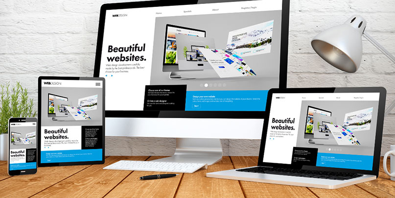
The user experience should be the same regardless of visitors’ device, as more than half of website traffic originates from mobile devices. You give them every chance to view and convert by making your landing page responsive, regardless of whether they’re using a desktop, phone, tablet, or other devices.
Your First Impression Starts Here
Creating high-quality landing pages will be a crucial component of your lead-generating strategy for each campaign or offer you make. Remember that your primary goal is to convert visitors to leads; don’t allow all your hard work to waste!
You’ll be well on your journey to a high-performing landing page if you stick to the recommended practices discussed above. As always, we at Clear Choice Marketing Group (CCMG) are available as your good neighbor for digital marketing services and resources.
Get in touch with CCMG experts today, and we’ll start building your brand’s killer landing page!


