


You put out a lot of time and energy attracting visitors to your website, but none convert. You are let down since your efforts and resources go to waste without results.
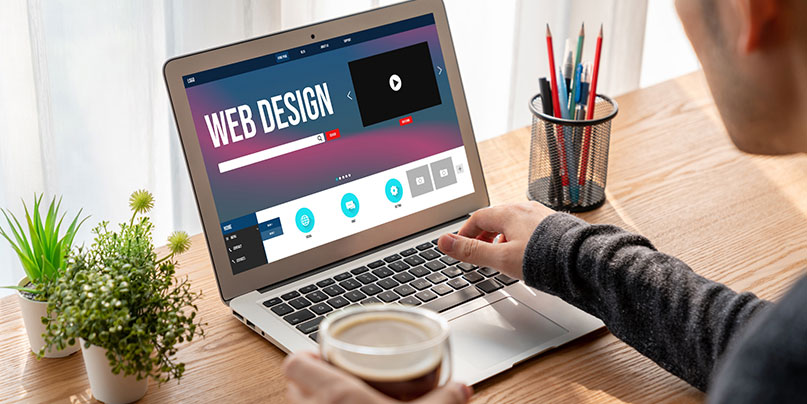
Web design is the foundation of your business, and it can make or break your product. If you don’t have a robust web design, you’re leaving customers with a wrong impression of your brand, which means they’re less likely to convert.
The way your website is intended significantly influences whether visitors choose to shop there or not. Since 75% of users judge a website based on aesthetics, attractiveness comes first. However, it may still be ineffective if your website cannot make users feel at ease and comfortable.
You must perfect the website design if you want higher conversion rates. Let it be the sophisticated features, usability, or navigation. Start with the fundamentals, whether they relate to a store in the United States or setting goals.
Better user experience, straightforward navigation, and mobile adaptability are the fundamentals of web design. These are the same guidelines, regardless of whether you’re hiring a web designer in your state or somewhere else in the world. This article could be a fast manual for enhancing web design to increase conversion rates.
1. Polish up your website’s UX Design.
User Experience (UX) design strives to make website navigation and usability simple and comfortable for end users. Because it can significantly increase conversions, you should pay greater attention to making your website design user-friendly. Several research studies have made a strong distinction between a well-structured and superior website design. According to the study, a well-designed user interface can increase conversions by 200%, while a more user-centered design can increase conversions by up to 400%.
2. Optimize the mobile or tablet’s response sensitivity.
Users prefer mobile-friendly websites even if a website is well-created and optimized for desktop users. You can cite Google Research, which indicates that more than 70% of users demand mobile-responsive websites. It demonstrates that customers easily use your website’s mobile-friendly versions. The layout and display of a website that is not mobile-responsive may be distorted, annoying users and increasing their bounce rate.
3. Conduct initial A/B testing on your website.
An A/B test identifies the superior performance of two various assets. A/B tests boost conversions, enhance UI/UX, and optimize marketing strategies.
Not every website should be designed the same. It’s also possible that a design trend or suggestion won’t work for one website or business but would for another. For instance, despite the fact that both companies are in the tech sector, the web design of a coworking space company may be different from that of an IT consultant organization. You might need to keep track of them if you want to use any of the popular design elements.
Your store conversions benefit from every design component. If a recent change isn’t helping to boost sales, you might need to monitor its effects and replace it with another, perhaps more appealing and practical, option.
You will have two distinct situations to research once the feature has been upgraded or replaced.
4. Experiment with effective color schemes for the website and the brand.
Your website is your first imprint to potential customers. That’s why we believe that it should be designed with appealing colors so that you create a positive first impression.
The colors you designate for your website are one of the most critical factors in a user’s experience with your site and brand. Your colors should be bold, bright, and eye-catching.
The choice of color is essential for your company’s branding, marketing, and promotions. According to the color psychology studies, more than 40% of website visitors who were asked which aspect of web design they valued more mentioned the choice of colors. The same source of statistics also indicates that 22% of first-time visitors look for and favor appealing hues. However, if the color palette is odd and unattractive, you can lose almost 25% of visitors.
5. Use negative spacing to your advantage on your brand’s website.
White space, also referred as negative space, is the bare area of the design that is not occupied by any design elements. For simplicity and comfort for the users, there must be white space between the design components. A landing page’s design may become cluttered if too many graphic elements are used to cover it.
Negative space can help you guide a user’s eye around your site and draw them into the content they prefer to read or view. It can also highlight specific elements or draw attention to certain pages, like contests or promotions.
Use the negative space to divide and emphasize information grids. Negative areas are great for drawing attention to critical parts of your site—like the call to action (CTA) button or a featured product listing.
6. Enhance the user’s experience by improving the page’s navigation.
A better user experience means that users can find what they’re looking for faster and easier. This will increase the number of users who find what they want on your site, increasing your conversion rate.
The more easily a user can navigate your website, the more likely they will stay on it for longer and spend more time engaging with your brand.
7. Be engaging with your Call To Action (CTA) buttons.
The CTA button or badge is the most crucial part of your website. It makes people take action and do what you want them to do. It would be best if you made it as easy as possible for them to click it so they can start enjoying all the benefits that they can get from your product or service.
Ensure that your CTA buttons are easy to read and clearly communicate what you want them to do. Focus on making your CTAs stand out by using color and size and placing them in positions where people are more likely to notice them.
8. Play around with straightforward and engaging web designs.
Forget complicated, long-winded sites that take forever to load. The future of the web is simple, clean, and streamlined—and it’s here to stay.
The website can also be kept straightforward and limited to a few options using a minimalist design. The unnecessary design components for your users might need to be eliminated or ignored. Your users may become distracted if you add more features and alternatives. So keeping things basic might help visitors and consumers of your business stay focused. Provide a direct, unambiguous path to help your users make decisions.
You may find hundreds of conversion optimization methods when you start looking into it. Stick to the important ones, though, and focus on them one at a time. To enhance the user experience, you can get to work. Research the purchasing process on your website to ease the stress and discomfort. Pursue a mobile responsive design to make sure your websites look good on mobile devices. Earlier in this article, some helpful advice was covered. Before employing new strategies, you should first analyze your company’s and your customers’ needs.